
One of the worst bugbears to possess is one that is shared by hardly anyone else. It’s lonely being the only person who cares about something. It’s even lonelier when the thing you care about makes you want to stamp your feet, tear your hair out and run naked into the streets while making the face of Edvard Munch’s The Scream. And so it is for me whenever I see a film poster, headline, book cover or screen caption featuring the incorrect use of the Cyrillic alphabet.
You might think this is a niche preoccupation. But you would be surprised how many times the name of “STДLIN” pops up in poster designs, supposedly representing “STALIN”. This phenomenon annoys me most when the entity depicted is not fictional. If you write the (nonexistent-in-any-language) word “STДLIN” instead of “STALIN” you are writing “STDLIN”. Which would be fine if you were attempting some kind of wordplay comparing the impact of the one-time Soviet leader to a sexually transmitted disease. But clever wordplay is not the intention of these designs. The intention of the incorrect use of the Cyrillic alphabet is to indicate one thing and one thing alone: “This is about something that is happening east of Warsaw! It is probably connected to the former Soviet Union! It should give you a frisson of creepy exoticism!”
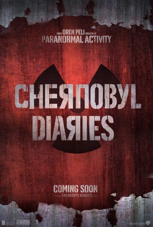
The most famous of these alphabetical abominations include the opening credits for Arnold Schwarzenegger’s Red Heat (where his name is given in Cyrillic as “Lyaiold Schwlyazeieggeya”) and the posters for the movies The Death of Stalin, Chernobyl Diaries and Borat. The name of the eponymous fake Kazakh, for example, is rendered as “ВОRДT”. This reads clearly as “Voyadt” in Cyrillic. I did not suffer decades of learning Russian and Ukrainian to deserve this cerebral meltdown. It is equally undeserved by the 250 million global users of Cyrillic, from Azeris and Bulgarians to Macedonians, Serbians and numerous other nationalities, not least the 20 million entirely non-fake Kazakhs.
Faux Cyrillic is prevalent enough in everyday design to have its own Wikipedia page where the phenomenon is described as “mimicry typeface” and rendered – painfully literally and truly horrifically – as “Fдцx Cчrillic”. This reads, in the most mind-boggling brain-bleed of them all, as “Fdtsx Schrillic”. I can just see someone like Elon Musk taking the name “Fdtsx Schrillic” and thinking: “That is a great brand name for my next metaversal AI interface venture.” Which is yet more proof that this typographical travesty has no place in a world where we want to encourage people to be more, not less, sane.
Despite the many millions of potential fellow sufferers of faux-Cyrillic-phobia, I do recognise that I plough a lonely furrow. The only place in the universe where I have found any solidarity is, sadly, Reddit. Typical responses to the use of pseudo-Cyrillic: “My eyes are bleeding.” “Another Hollywood film-maker trying to make something look ‘Russian’ without paying someone who actually knows Russian.” “It’s annoying and maybe even a little bit racist.” “Bad design. Bad colours. Everything bad.” That’s exactly it: everything bad. These are my people.
To my great joy, though, I have recently discovered a subset of my tribe: German speakers who object to the gratuitous use of the umlaut. This is commonly – cömmonly? – used in the world of heavy metal, the chief offenders being Blue Öyster Cult, Mötley Crüe and Motörhead. (See Kerrang’s glorious Brief History of Heavy Metal Umlauts for the full hall of shame.) In the case of Motörhead, there is no grammatical or linguistic reason for the second “o” to have the umlaut any more than the first “o” to have it. But that’s the whole point: the reason is not to do with logic, reason or the laws of any known alphabet, it is to do with implication. It is about the shared emotional language of the onlookers: “We don’t care if this looks weird to you, it means something to us. And you are not one of us.”
I suspect the same is happening with Fdtsx Schrillic. As Motörhead’s Lemmy said of his umlaut: “I only put it there to look mean.” The misuse of language is there to menace, to emphasise the “other”, to suggest the exotic, the foreign, the “enemy”, to separate “them” and “us”. But it isn’t mean or scary. It is just very, very silly indeed.
-
Viv Groskop is a comedian and author of One Ukrainian Summer


