“The red dress,” said Valentino Garavani in 1992, “is always magnificent”.
This week, after the announcement of his death at the age of 93, the red dress – and the distinctive shade of red long associated with the designer known simply as Valentino – is back in the spotlight.
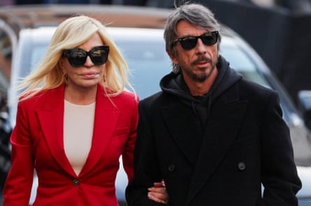
In tribute, the cover of Vogue Italia’s February issue – out this month – will be a take on Valentino red, while Donatella Versace wore a bright red suit when she went to pay tribute to her fellow designer, as he lay in state in Rome on Thursday.
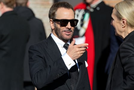
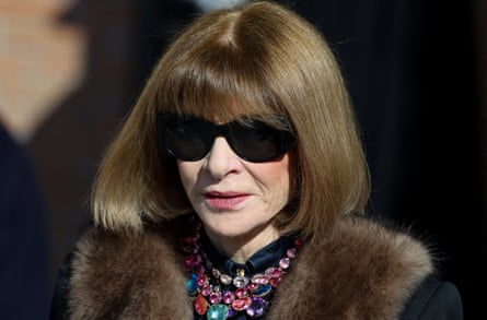
While most of the mourners at his funeral on Friday – including the actor Anne Hathaway, and fashion’s Anna Wintour, Donatella Versace and Tom Ford – were dressed in black, Damian Hurley, the son of the actor Elizabeth Hurley, accessorised with a bright red scarf.
Valentino produced his first red dress in his debut collection in 1959. Called Fiesta, it was a strapless gown decorated with roses across a full skirt. He was famously inspired by the sight of an older woman at the opera wearing a red dress, and how she stood out from the crowd.
It was this impact that arguably made the designer continue to use the colour throughout his career, says Alistair O’Neill, the curator of Somerset House’s Valentino: Master of Couture exhibition in 2012. But, as images of women wearing Valentino’s dresses attest, the specific shade mattered: scarlet, with a hint of blue.
“It’s a tone that works across a range of skin colours and it makes nearly all women look great,” says O’Neill. “I think that’s because it’s a very pure and clean colour but it has a luminosity about it.”
Charlie Porter, a fashion writer who worked on Valentino Rosso, a 2022 coffee table book about the colour, notes that Valentino developed his colour before Pantone began systemising colours in the early 60s.
“[Now] if you say the number on the Pantone chart, a graphic designer in Tokyo can design with the same colour as someone in Los Angeles,” he says. “[Valentino’s] red is a red with real sensitivity and depth and human feeling because it’s before this time of ‘let’s choose a red’, mechanical colour.”

For Vogue Italia’s cover, the magazine’s head of content, Francesca Ragazzi, says the team worked with Valentino’s foundation to identify the Pantone shade closest to Valentino red – settling on 2347C because it was “the most vibrant, it best expresses a sense of light”.
Italy – and Rome – were, says Porter, central to the creation of the shade. “There’s location to colour, which we don’t think about so much now,” he says. “[But] the way the sun sits in the sky or the tilt of the Earth makes colour be seen in different ways.”
If Valentino red is of its time and inseparable from its creator, it also sits within a broader resurgence of red in fashion. The “unexpected red theory”, which first gained traction in interiors, has spilled into wardrobes, with red scarves – notably a foulard by the British brand & Daughter – becoming a familiar sight at fashion weeks.
Kassia St Clair, the author of the 2016 colour history The Secret Lives of Colour, says red clothing, which was originally produced using expensive dyes, has long been a symbol of luxury, worn by kings, the military and senior figures in the church.
“It really has said the same things – power, wealth, status – for as long as we know,” she says. There may also, be a biological dimension. “It’s really difficult to disentangle what is our cultural conditioning and what is natural human reaction. [But] of all the testing that gets done, there’s the most interesting evidence for red having some kind of impact on us.”
For Valentino, red also became deeply personal. “When he designed the Fiesta dress, he decided that he wanted to have a red dress in every collection that he produced. It was a lucky symbol for him,” says O’Neill.
Sixty-seven years after Fiesta, Valentino red remains a defining part of the designer’s legacy. “Legacy means leaving something to the world, and it is extraordinary that Valentino was able to leave a colour as a universal language, one that will remain for ever in the global imagination,” says Ragazzi.
Not everyone is convinced Valentino and red will remain so closely intertwined in the years to come, however. Porter argues there is a more contemporary reference that many associate with Valentino – one not designed by him at all.
“In the public imagination right now, the biggest talking point about Valentino is the [2010] Rockstud shoes that should or should not be worn in The Devil Wears Prada 2,” he says. “I think when someone passes, then we can enter into a eulogising world of ‘it’s changed something for ever’. I don’t think it has, actually.”
St Clair also disputes the idea that red will now become more popular because of renewed relevance, arguing this is a colour that does not need new associations. “Valentino has a very specific place in our time, and is huge for our time,” she says. “But red transcends that.”

 3 months ago
68


