For more than 25 years, Pantone, which describes itself as “the global authority for colour communication and inspiration”, has attempted to prophesy the year ahead by choosing its specific colour. For 2026, it is hedging its bets on something called cloud dancer.
While it’s highly unlikely that the next 12 months can be neatly summarised by one colour before the year has even kicked off (Pantone’s announcement took place in December), it still garners headlines because, in a way, Pantone’s decision does reflect on some level what is happening in the zeitgeist – or, at least, what is expected to happen. After the economic crash in 2009 came mimosa, a “warm and engaging” shade of yellow said to represent hope and optimism (it rang true with a mimosa-coloured sofa becoming a must-have and everyone taking up daily affirmations). In 2016, there was the blending of serenity and rose quartz – AKA the ubiquitous millennial pink – while last year’s mocha mousse is the reason you are seeing brown everywhere.
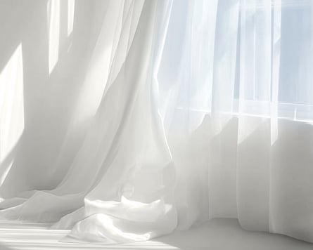
Pantone describes cloud dancer as “a billowy white imbued with serenity”, which serves as “a symbol of calming influence in a society rediscovering the value of quiet reflection”. It’s basically white, but not Hollywood veneer white. A sort of off-white. If you follow Molly-Mae Hague, or any other influencer with a home that resembles a clinical setting, you’ll already be familiar with it. Yet, against a background of rising white nationalism and the culling of diversity, equity and inclusion programmes in the US and UK – not to mention vibrant colours making a massive comeback on the catwalks after the death of quiet luxury – critics quickly called it “Pantone-deaf”. In an interview with the Washington Post, Pantone’s vice-president, Laurie Pressman, defended the choice, saying: “Skin tones did not factor into this.” This only further fuelled division with a flurry of pieces on “wokeism”.
Nonetheless, Pantone is standing firm behind its decision, launching collaborations with Motorola, Post-it, and even Play-Doh.
So, what does it all mean, and why now? Here, three colour experts and cultural commentators weigh in.
‘It feels like a eugenics-y move’
Nicole Ocran, writer, podcaster and co-author of The Half of It – Exploring the Mixed Race Experience
“There’s been so much around the clean-girl aesthetic, quiet luxury, tradwives and the idea of purity, that my immediate reaction when I saw the announcement was, ‘Whoa, this feels very deliberate.’ I couldn’t help but think of the Sydney Sweeney jeans campaign. It feels like a eugenics-y move. It’s impossible to separate politics from fashion.
“There is a pushback against ‘wokeism’ and the idea of, ‘Oh, it’s just a colour, there’s nothing more to it.’ But Pantone are trend forecasting. So to say they didn’t look into it deeper is strange. They assign meaning to things that feel frivolous.
“The name suggests you are up in the clouds with not a care in the world. Again, this really lends itself to a particular type of person who can feel that way. I would totally love to just vibe out and not have to worry about anything. But given the way things are moving, it’s really scary and it’s really concerning.
“We’re all being told that we need to look a very specific way and that this specific style is the most aesthetically pleasing. For me, it feels like a stripping back of any individuality. And that’s really depressing to think about.”
‘It doesn’t bring anything new’
Paddy O’Donnell, international brand ambassador for Farrow & Ball, and freelance interior consultant
“Our bestselling paints are always white, so it’s a bit of a non-story. Most people default to using white when decorating. It’s their comfort zone, as they are terrified of using colour. If you spoke to any other paint manufacturer, they’d probably all say their bestselling colours are off-whites. So it kind of doesn’t bring anything new to our discussion.
“Cloud dancer is not a white white, it’s a nuanced white. If we were looking for an equivalent on the Farrow & Ball colour card, it would sit somewhere between strong white and ammonite – it’s warmish, rather than anything too sharp and too clean. It’s a really good white, a really useful white for trims and ceilings.
“[Trend-wise] I’m seeing a huge surge towards lilacs. The idea is really terrifying, but think of it like a bunch of Dutch pink tulips. It’s a slightly sharp, pale terracotta, which leans towards apricot and blush. We’ve had loads of chestnuts and tobaccos, too. I love a dark cacao brown, and a dark cacao brown in full gloss is so sexy. Brown is the best neutral in the world because every colour family works with it. Be careful with yellows, because it goes into banana territory, but pinks work with it, reds work with it, blues work with it, greens work with it. It’s just unbelievably chic.”
‘A white supremacist dog-whistle’
Gabrielle Minoli, writer and content creator @saltlacroix
“We’ve clocked cloud dancer as a white supremacist dog-whistle, and none of these descriptors do anything to help their case. Every justification has sounded more loaded than the next. If anything, I was a bit surprised by the name and how flippant it sounds. The concept of ‘cloud dancing’ is very unserious, but I suppose it reflects how we’re more comfortable dancing around pressing societal issues and ‘isms’ or ignoring them, rather than facing them head-on.
“It reminds me of two-ply toilet paper – three-ply if we’re being generous. It’s the uncanny veneers of a Fox News broadcaster. It’s the threatening silence of a suburb that has driven out anyone with a skin tone deeper than beige.
“Curiously, Pantone’s positioning of cloud dancer also reads as a nod to generative AI. They’ve called it a blank slate, and a shade that ‘opens the door to increased imagination and innovation’. This is eerily similar to language used to persuade us to buy into AI tools that actually chip away at our creativity and critical thinking. In that way, cloud dancer reminds me of out of touch big tech executives ready to wipe their own slate clean of pesky human employees and the burden of paying them.”
‘It’s incredibly neutral’
Jules Standish, colour consultant and author of How Not to Wear Black
“When I am working with a client, I will always talk about white at the end of their analysis once I know whether they’ve got a golden or a blue base – whether they are warm or cool.
“Cloud dancer is neither warm nor cool, so it’s incredibly neutral. It’s very hard in colour analysis to find a colour that is entirely neutral, particularly when you’re looking at shades of white.
“If I had to say one season it is going to look best on, it would probably be summer. A brilliant white looks fantastic on winters as they have cool tones. For autumns or spring, I would suggest ivory creams and buttery whites.
“The thing about white in colour analysis is if it’s the wrong shade for you, it can make you look like you’re in a hospital bed. Even if you have a warm skin tone, a brilliant white can make the skin look very ashy and very blotchy. I often say to people, if you want a sick day at work, if a bright white is not in your season, wear it and someone will look at you and go, ‘Please don’t come in today.’”
To read the complete version of this newsletter – complete with this week’s trending topics in The Measure and your wardrobe dilemmas solved – subscribe to receive Fashion Statement in your inbox every Thursday.